2017 = Meh...
That assessment of the year 2017 has only to do with the year in baseball cards. If I was giving a grade to 2017, the year itself... Well, I'd be using a whole lot of words that I don't really want to put on this site...

First off, I’d like to congratulate Adrian Beltre on his 3,000th hit. I never imagined he would have such a career after pulling his rookie cards in 1997. Nabbing both Refractor versions of his 1997 Bowman Chrome and 1997 Bowman's Best rookie cards out of packs, remains a high point from late 1990’s collecting. I’ll come back to Beltre in a little bit… He is going to help me illustrate a very important point a little later on...

Clayton Kershaw is always a desired card, no matter the year or design...
Since January 1, 2017, I have spent less than $100 on baseball cards. That number hasn’t been that low in 30 years… Most of the reasons for that are financial, but there is a decent percentage that can be stated as general disappointment with cards offered in 2017.

Rediscover Junk Wax commons everyone threw away 30 years ago! Now with extra added gold foil!
Every year since 2010, I've lost more and more interest in buying new cards. Money and my long time card shop closing in 2013 were factors, of course. However the biggest culprit to me is the Topps Monopoly. When Bud Selig gave Topps the exclusive MLB License for producing cards, I knew I was going to grow tired of having only one option for cards. After years of choice, I now only have whatever flavor Topps wants to offer. No choices!

Not that Topps doesn't make nice cards. I like that Jackie Robinson a whole lot. But I'm only going to get Jackie Robinson from Topps now. I don't get to see Upper Deck or Pinnacle's take on Jackie Robinson anymore. Only Topps. Be it disguised as Bowman, Gypsy Queen, Heritage, Archives or whatever clothes Jackie is wearing, they are all Topps...
Point being... I have bought very little for 2017 baseball cards. Because I've seen the gimmicks, I'm familiar with the format. I've only purchased cards at retail stores the last few years. And only when I find something I really want. I just haven't found much that I want this year... Especially anything that looks like 1987 Topps...

So here is my take on the 2017 card brands that I'm familiar with. I had to buy a minimum of 1 pack of each product in order to place them on my list.

I’ve always wanted to like this set… It just doesn’t work out that way after I buy some packs. I like the idea of the set... A throwback to the old Allen & Ginter tobacco cards of the late 1800's, featuring not only top baseball players, but including other athletes and just plain stuff. Some of the gimmicks they include every year are awesome. I like my Area 51 card a lot, and pulling a card of Billy Mitchel from 2008 Allen & Ginter, the same week that I first saw The King of Kong, was decidedly way cool!

So let’s give 2017 a try to see if it works out any better this year. Just going with a 14 card value pack, so I'd only be out $6. And nope... Still not a fan…

Yippee! A short print! A gimmick that Topps never gets sick of using, is to take a percentage of a set, and make those cards harder to find. Not so difficult that they are ridiculously expensive, just that you will have a tough time pulling all the teams and players you want, because of their manufactured scarcity.... Glad I'm not a Cubs fan, they were an ultra trendy team to short print this year...

Featuring retired players is a staple of Allen & Ginter, and Brooks Robinson is a great choice that hasn't been done to death in recent years. Jeter -not taking anything from all he accomplished as a player- hasn't even been retired long enough to be eligible for the Hall of Fame ballot...

Hey Jeter.... How can we miss you if you never go away?
Yeah, these are fine, but ultimately do nothing for me... They get redundant too quick. Flipping through a stack of Allen & Ginter that is taller than three cards, usually bores me to tears. Similarly washed out pictures made to look like paintings, with way too many mug shots. I can see why some people love this set, but after a decade of trying, I’m just going to declare that it’s not for me…

The mini's are still very cool, even if they have to gimmick them up like this "black" parallel. I do want to collect the Twins and Rockies cards from Allen & Ginter (and Expos if they ever made any), but I'm not devoting my tiny card budget on this anymore.

Overall, I like the dark color definition to the photos this year. A few years ago, the bowman sets appeared overly pastel and almost cartooney. 2017 looks a whole nicer to me than 2013 did. So much so, that it did the impossible... I like a Joey Votto card!

If you look beyond that damn scanner lint, you will see 2016's golden boy, Kris Bryant. He was in the first pack of 2017 Bowman I opened.

After the set came out, I liked the look of the few cards I'd seen online. Plus it had an interesting checklist of a bunch of prospects I was needed cards of. The purchase of one retail blaster ties 2017 Bowman with one other brand I will discuss later, for most money spent on my Topps choices.

The 80 card box yielded 3 Rockies. The best third baseman in the game (in my humble opinion), and two rookies that have both been major contributors to Colorado's success this season, Jeff Hoffman (and his wacky face!) and Denver native, Kyle Freeland.

The big draw with Bowman for me has always been the great selection of minor league players. For that reason, I always try to allocate a few bucks to Bowman to at least get a sample of what is on the horizon for top prospects. Along those lines, I was very happy the blaster contained these two...

Former Rockie Dante Bichette’s son and former Expo Vladimir Geurrero's son, both play in the low minors for the Toronto Blue Jays. Vlad Jr. is a top prospect for Toronto, who is much heralded with a swing similar to his father. I don't know nearly enough about Bo Bichette. He probably was one of the little kids running around on the field before Rockies games in the late 1990's

My box didn't contain any Twins on the major league roster, but three of Minnesota's top 10 prospects were inside. Kirilloff (Minnesota's 1st round pick in 2016) will miss the entire 2017 season after tearing an elbow ligament, needing Tommy John Surgery. Romero has seen his stock increase over 2017, and is quickly becoming a big part of Minnesota's future plans. Jay was Minnesota's 1st round pick in 2015 (#6 overall), as a college relief pitcher that the old Twins regime thought they could convert to a started. It wasn't working, Jay got hurt, and his future is up in the air.

I was pleasantly surprised with 2 "hits" in the blaster I bought. First one was this Alex Verdugo Top 100 Green Refractor, numbered out of 99.

The second "hit" was a Justus Sheffeild (and his puffy face) Blue Refractor, numbered out of 150.
Overall, I can't find too many bad things about Bowman. I really enjoyed opening the box and wouldn't hate more...

Yes... The asterisk to Topps Monopoly... Panini is the parent company that puts out cards under the old Donruss name. A trademark that has gone through several owners, since first being introduced in 1954. Donruss entered the MLB card market in 1981. A lot of stuff happened between then and now, that I'm not even going to begin to try and summarize...

Anyway. Panini isn't allowed to make Major League Baseball Cards, due to Topps exclusive contract. They can however make a card set of Major League Baseball players. Difference being, they can show the players, just not any MLB logos. Due to the Major League Players Union existing separate from Major League Baseball, Panini needed only to negotiate a contract with the Players Association. Circumventing Bad Selig's ruling on baseball cards... Which only makes me smile...

Panini usually chooses pictures that minimize the missing logos. Catchers are usually shows wearing chest protectors, batters are typically shown swinging a bat, so their arms cover the jersey logo. They usually do a good job in hiding their handicap. The lack of logos are not a deal breaker to me, but the cards are still somewhat off-putting to look at.

This was one of my favorite cards in the pack. The only noticeable missing part being the yellow P on his hat.
And the 7 year old in me giggled uncontrollably as I typed that sentence...

Since Panini is not licensed by Major League Baseball, they can print cards of Pete Rose and get away with it. When a card set includes a small amount of "Legends of the Game", it's pretty cool to pull a Pete Rose from a pack. Even logo-less retro photos look better with designs that are more representative of a specific set. While not an outright copy, 2017 Donruss is a nice twist on 1990 Donruss (the design this was based on). At least it's not as obnoxious as 1990 Donruss was...

2017 Donruss gave me my only autographed card (with a bonus jersey chunk) pulled from a pack this year. For only buying one $5 pack, Donruss made a strong case for itself... And from the looks of his minor league stats, Anderson is having a pretty decent season.

My 2017 Gypsy Queen purchase amounted to a single value pack for $9. This contained thee regular 6 card packs, plus a 4 card pack of retail exclusive, green bordered parallel cards. Between 22 cards for $9, I got one Rockie, one Twin and a bunch of stuff that didn't interest me.


Yup, I'm bored by this... I do like them slightly more than Allen & Ginter. If Topps is going to use the paint filter on baseball photos, including the background helps in my book. Not a whole lot, but it helps...

1968 Topps stands out among it's neighbors. 1966 & 1967 Topps are about as bland as you can get. 1969 Topps is even blander. (Though I have a real soft spot for 1969 Topps... For it's day, they used some great photos under a very basic design.) 1968 was the loud neighbor on the quiet block. Okay, not too loud, the design is based on varying close-ups of a burlap sack... But it sure was different!

Topps heritage is usually the second major set released every year, after series 1 of the Topps base set. Heritage usually gives you a first look at free agents and players traded during the off-season, in the uniforms of their new teams. And if they don't have a new photo? Well then you draw the new uniform in Photoshop! Back in 1968, they didn't have Photoshop... They just put a cover-up blob over your hat logo on the negative, to document offseason transactions.

The Toronto Blue Jays didn't exist in 1968, which makes this card of former Twins ace look really strange to me... That's a whole lotta blue on burlap.

I only bought a handful of retail packs of 2017 Heritage, but I got a lot of Twins. Despite three seasons (so far) of watching Buxton show brief promise at the plate, then spiralling into month-long slumps, Buxton remains one of the players I root hardest for. Watching him play Center Field, making at least one amazing catch every single night, really makes you want to see him put it all together...
And then there's Mauer... At least he didn't get hurt having this picture taken...

1968 Topps didn't have Chrome cards nor Refractors... I'll forgive it's awkwardness because it's pretty cool. (And serial numbered out of 568.) I think Mazara has a great deal of potential. I just refuse to like him since he plays for the Texas Rangers...

I finally located a blaster of 2017 Stadium Club after looking all over the usual retail suspects. It's hard to know weather I should blame Aaron Judge or Cody Belanger for the perceived shortage of 2017 product. Seriously, I haven't seen retail shelves so understocked in baseball cards in well over a decade...
And 40 cards for $20? Damn you Topps... At these prices, there's no way I could afford to collect the set, and this is the exact type of set I want to own.

This is why I love Stadium Club cards... That photo is gorgeous! The purple sky over the Texas Rangers ballpark is striking against the reds and blues of Lucroy's catching gear and jersey. Now Lucroy will be wearing purple after his Sunday trade to Colorado. I look forward to seeing what he ends up doing here...

Following their own trend, Stadium Club is a nice mix of current players and legends. I'm a huge fan of this rarely seen Hank Aaron photo... Another reason I love Stadium Club cards...

Topps seems to be on a Brooks kick this year, and that's a good thing. As I read on Night Owl's blog, the photo is of the rare 1971 all orange Orioles road uniforms. Combined with a backdrop of an empty Fenway Park, makes this an incredibly cool photo!

Continuing with the theme of legends, here's Bo Jackson. Not to discredit Bo, but with a career cut short by a devastating injury, it's hard to consider him a legend. I will grant him the status of Hobby Legend, as there were few bigger hobby stars between 1988-1990. This is a great shot of him sprinting to third at the 1989 All Star Game, with the umpire blocking Ryne Sandberg's cameo...

It's not only the hobby darling of 2017's Stadium Club rookie card, but it's also the not-very-rare black parallel version! Which is cool... I like to own a decent rookie card of each of the major stars that have started their careers during the last 30 years. This one features a nice photo, and is a small step above his lowest level rookie card. I'm happy to have this in my collection to represent Aaron Judge. It's not like I'm going to get a 1 of 1 autographed jersey patch uberfractor any day soon...

Every pack in the blaster had at least one card with a beautiful photo, with this one showing an angle of PNC Park in Pittsburgh that's not often seen. My main complaint about 2017 Stadium Club is the blobby foil used for the players names. I feel it detracts from the image. A more subtle, narrow font would match up better with these classy photos. But that's a minor complaint...

At least the blobby font is attempting to cover up butts on Nolan Arenado's card... And like Taillon's card, this is a very unique angle of Coors Field that makes me feel like I'm there. I know all those signs, sat in those bleachers, bought a Rockie Dog under that scoreboard, climbed those stairs above Nolan's head... This is such a great card...
While I was interested in getting at least a couple of the Twins and Rockies in the set (Arenado being the lone representative), the one card I wanted more than any other was the Tim Raines Expos card. Topps got the rights to use the iconic 1989 photo of him standing on the field at Olympic Stadium. The roof was open to see the tower above, with the rim of the bowl rising up all around him. I need to own this card, and the blaster did not giveth...

Sunday morning I did found the Image on Twitter. Mere hours before Raines would officially be inducted into the National Baseball Hall of Fame. He was inducted as a Montreal Expo, and all is right.

Topps is the first set that comes out every year. Going into 2017, I wasn't a fan of Topps' choice in design for their 2017 flagship set. Topps released images of the upcoming set, months before 2016 ended, and my first impression was: there's a whole lot of wasted space on each card...

It's an improvement over last year's similar design, which was ruined by fading out the photos on two corners. But in my opinion, there are a set amount of design elements to drop on top of a photo before it becomes overkill... This is overkill...

The overly large slanted logo bothers me. But not nearly as much as the mess of grey bars...

Great photos are used, so that is absolutely not the problem with 2017 Topps. I love this shot of Jose Berrios running onto Target Field. The angle looking up at the stands shows a lot of stadium detail. Too bad one quarter of the picture is covered up by unnecessary garbage art...

I didn't buy much Topps this year. Only two rack packs of series one and one rack of series two. From what I've seen, the Twins cards look great.
The backs of the cards however....

Getting back to the newest Mr. 3000, here is the back of Adrian Beltre's 2017 Topps card. Where are his statistics from 1997-2011? The card says Beltre played 19 years in the Major Leagues, yet Topps is now only showing the previous five seasons?
This is just plain inexcusable. For every year that I've collected, I looked forward to Topps for one thing and one thing only. They were the only card brand to list full statistics for every season played. I read Topps card backs every year. I liked to compare seasons that players had, and follow their year to year trends, and that was taken away in 2017 for no reason. I wouldn't be as big of a baseball fan as I am without studying the full career statistics of the entire 1987 Topps set.
Adrian Beltre has played 20 seasons in the Major Leagues. Not five... Go ahead and condense those lifetime statistics on all of the other superfluous sets they print each and every year, but the Topps base set needs to have all the statistics. Go get a 1994 Topps Nolan Ryan (I'll wait...) and destroy your eyesight while trying to read 27 seasons worth of statistics on a 2.5" x 3.5" card. Yeah, it hurts! But they are all there! From 1966 through 1993, every season is fully listed! The way it should be!
And I'm well aware that I have bought a Topps card. Stop taking up precious space with a giant twitter handle and redundant oversized Topps logos all over the place. It’s a card made to honor a specific player, not an advertising vehicle for the company that made it. I have already paid for this product! Stop advertising at me!


After seeing the hottest rookie of the 2017 season, here is a nice foil parallel of the hottest rookie going into the 2017 season. This may not be a popular statement, but I have a feeling that when all is said and done, Yoan Moncada will have had the better career between he and Judge. I base that on nothing and could very likely be completely wrong...

And I don't see either having the career this guy did... Even at 40 and tubby, Ken Griffey Jr. was still one of my favorite players. Here is a needless insert card of him. I don't mind owning it, but the insert set is just worthless bloat.

I like R.A. Dickey... He had a brief cameo for Minnesota in 2009. But you would never know that if you flipped this card over...
Sorry... Removing the career stats still really irks me...

Alright, let's end this on a positive note! Pat Valaika has been a valuable utility player, with some power, for Colorado all season. I was happy to pull his gold parallel from the only series 2 pack I bought. When you flip it over, you don't have to worry about missing anything. He's only played two years in the Majors!
I didn't even get into all the Short Print and Super Short Print and wacky photo variations and all that other gimmicky nonsense Topps is now cramming into it's flagship set. All of that stuff has done so much damage to their base brand in my mind, the cutback on statistics should have been seen coming...

Even Jason Motte looks positively constipated at the sight of 2017 Topps... I'm sure he's looking at his previous two Rockies cards, and thinking 2015 Topps was an attractive design that worked... 2016 Topps was a mess that was starting to lose it's way... While 2017 Topps makes me not want to buy cards anymore...
And for the most part, I haven't...
Believe it or not, this was part of a much longer post that I had to split into two parts. This was part two... Part one will come along shortly...

First off, I’d like to congratulate Adrian Beltre on his 3,000th hit. I never imagined he would have such a career after pulling his rookie cards in 1997. Nabbing both Refractor versions of his 1997 Bowman Chrome and 1997 Bowman's Best rookie cards out of packs, remains a high point from late 1990’s collecting. I’ll come back to Beltre in a little bit… He is going to help me illustrate a very important point a little later on...

Clayton Kershaw is always a desired card, no matter the year or design...
Since January 1, 2017, I have spent less than $100 on baseball cards. That number hasn’t been that low in 30 years… Most of the reasons for that are financial, but there is a decent percentage that can be stated as general disappointment with cards offered in 2017.

Rediscover Junk Wax commons everyone threw away 30 years ago! Now with extra added gold foil!
Every year since 2010, I've lost more and more interest in buying new cards. Money and my long time card shop closing in 2013 were factors, of course. However the biggest culprit to me is the Topps Monopoly. When Bud Selig gave Topps the exclusive MLB License for producing cards, I knew I was going to grow tired of having only one option for cards. After years of choice, I now only have whatever flavor Topps wants to offer. No choices!

Not that Topps doesn't make nice cards. I like that Jackie Robinson a whole lot. But I'm only going to get Jackie Robinson from Topps now. I don't get to see Upper Deck or Pinnacle's take on Jackie Robinson anymore. Only Topps. Be it disguised as Bowman, Gypsy Queen, Heritage, Archives or whatever clothes Jackie is wearing, they are all Topps...
Point being... I have bought very little for 2017 baseball cards. Because I've seen the gimmicks, I'm familiar with the format. I've only purchased cards at retail stores the last few years. And only when I find something I really want. I just haven't found much that I want this year... Especially anything that looks like 1987 Topps...

So here is my take on the 2017 card brands that I'm familiar with. I had to buy a minimum of 1 pack of each product in order to place them on my list.
*****

Allen & Ginter

So let’s give 2017 a try to see if it works out any better this year. Just going with a 14 card value pack, so I'd only be out $6. And nope... Still not a fan…

Yippee! A short print! A gimmick that Topps never gets sick of using, is to take a percentage of a set, and make those cards harder to find. Not so difficult that they are ridiculously expensive, just that you will have a tough time pulling all the teams and players you want, because of their manufactured scarcity.... Glad I'm not a Cubs fan, they were an ultra trendy team to short print this year...

Featuring retired players is a staple of Allen & Ginter, and Brooks Robinson is a great choice that hasn't been done to death in recent years. Jeter -not taking anything from all he accomplished as a player- hasn't even been retired long enough to be eligible for the Hall of Fame ballot...

Hey Jeter.... How can we miss you if you never go away?
Yeah, these are fine, but ultimately do nothing for me... They get redundant too quick. Flipping through a stack of Allen & Ginter that is taller than three cards, usually bores me to tears. Similarly washed out pictures made to look like paintings, with way too many mug shots. I can see why some people love this set, but after a decade of trying, I’m just going to declare that it’s not for me…

The mini's are still very cool, even if they have to gimmick them up like this "black" parallel. I do want to collect the Twins and Rockies cards from Allen & Ginter (and Expos if they ever made any), but I'm not devoting my tiny card budget on this anymore.
*****

Bowman
Overall, I like the dark color definition to the photos this year. A few years ago, the bowman sets appeared overly pastel and almost cartooney. 2017 looks a whole nicer to me than 2013 did. So much so, that it did the impossible... I like a Joey Votto card!

If you look beyond that damn scanner lint, you will see 2016's golden boy, Kris Bryant. He was in the first pack of 2017 Bowman I opened.

After the set came out, I liked the look of the few cards I'd seen online. Plus it had an interesting checklist of a bunch of prospects I was needed cards of. The purchase of one retail blaster ties 2017 Bowman with one other brand I will discuss later, for most money spent on my Topps choices.

The 80 card box yielded 3 Rockies. The best third baseman in the game (in my humble opinion), and two rookies that have both been major contributors to Colorado's success this season, Jeff Hoffman (and his wacky face!) and Denver native, Kyle Freeland.

The big draw with Bowman for me has always been the great selection of minor league players. For that reason, I always try to allocate a few bucks to Bowman to at least get a sample of what is on the horizon for top prospects. Along those lines, I was very happy the blaster contained these two...

Former Rockie Dante Bichette’s son and former Expo Vladimir Geurrero's son, both play in the low minors for the Toronto Blue Jays. Vlad Jr. is a top prospect for Toronto, who is much heralded with a swing similar to his father. I don't know nearly enough about Bo Bichette. He probably was one of the little kids running around on the field before Rockies games in the late 1990's

My box didn't contain any Twins on the major league roster, but three of Minnesota's top 10 prospects were inside. Kirilloff (Minnesota's 1st round pick in 2016) will miss the entire 2017 season after tearing an elbow ligament, needing Tommy John Surgery. Romero has seen his stock increase over 2017, and is quickly becoming a big part of Minnesota's future plans. Jay was Minnesota's 1st round pick in 2015 (#6 overall), as a college relief pitcher that the old Twins regime thought they could convert to a started. It wasn't working, Jay got hurt, and his future is up in the air.

I was pleasantly surprised with 2 "hits" in the blaster I bought. First one was this Alex Verdugo Top 100 Green Refractor, numbered out of 99.

The second "hit" was a Justus Sheffeild (and his puffy face) Blue Refractor, numbered out of 150.
Overall, I can't find too many bad things about Bowman. I really enjoyed opening the box and wouldn't hate more...
*****

Donruss
My 2017 purchase was limited to one $5 Jumbo Pack.

Anyway. Panini isn't allowed to make Major League Baseball Cards, due to Topps exclusive contract. They can however make a card set of Major League Baseball players. Difference being, they can show the players, just not any MLB logos. Due to the Major League Players Union existing separate from Major League Baseball, Panini needed only to negotiate a contract with the Players Association. Circumventing Bad Selig's ruling on baseball cards... Which only makes me smile...

Panini usually chooses pictures that minimize the missing logos. Catchers are usually shows wearing chest protectors, batters are typically shown swinging a bat, so their arms cover the jersey logo. They usually do a good job in hiding their handicap. The lack of logos are not a deal breaker to me, but the cards are still somewhat off-putting to look at.

This was one of my favorite cards in the pack. The only noticeable missing part being the yellow P on his hat.
And the 7 year old in me giggled uncontrollably as I typed that sentence...

Since Panini is not licensed by Major League Baseball, they can print cards of Pete Rose and get away with it. When a card set includes a small amount of "Legends of the Game", it's pretty cool to pull a Pete Rose from a pack. Even logo-less retro photos look better with designs that are more representative of a specific set. While not an outright copy, 2017 Donruss is a nice twist on 1990 Donruss (the design this was based on). At least it's not as obnoxious as 1990 Donruss was...

2017 Donruss gave me my only autographed card (with a bonus jersey chunk) pulled from a pack this year. For only buying one $5 pack, Donruss made a strong case for itself... And from the looks of his minor league stats, Anderson is having a pretty decent season.
*****

Gypsy Queen

As much as I can't stand the color red, I do like this Mike Trout card.

Here's my Rockie...

Here's my Twin...

Here's a Green Retail Parallel...
*****

Topps Heritage

Topps heritage is usually the second major set released every year, after series 1 of the Topps base set. Heritage usually gives you a first look at free agents and players traded during the off-season, in the uniforms of their new teams. And if they don't have a new photo? Well then you draw the new uniform in Photoshop! Back in 1968, they didn't have Photoshop... They just put a cover-up blob over your hat logo on the negative, to document offseason transactions.

The Toronto Blue Jays didn't exist in 1968, which makes this card of former Twins ace look really strange to me... That's a whole lotta blue on burlap.

I only bought a handful of retail packs of 2017 Heritage, but I got a lot of Twins. Despite three seasons (so far) of watching Buxton show brief promise at the plate, then spiralling into month-long slumps, Buxton remains one of the players I root hardest for. Watching him play Center Field, making at least one amazing catch every single night, really makes you want to see him put it all together...
And then there's Mauer... At least he didn't get hurt having this picture taken...

1968 Topps didn't have Chrome cards nor Refractors... I'll forgive it's awkwardness because it's pretty cool. (And serial numbered out of 568.) I think Mazara has a great deal of potential. I just refuse to like him since he plays for the Texas Rangers...
*****
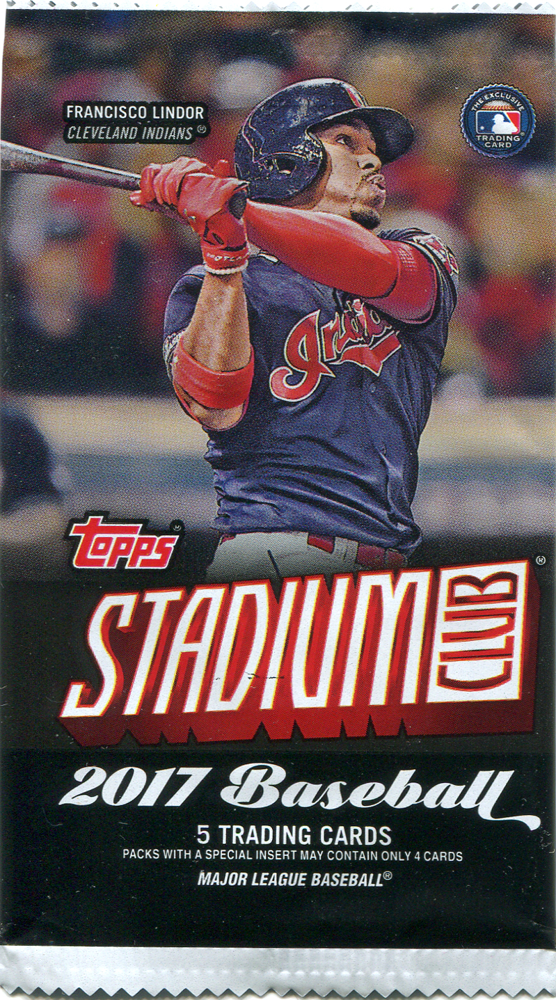
Stadium Club
And 40 cards for $20? Damn you Topps... At these prices, there's no way I could afford to collect the set, and this is the exact type of set I want to own.

This is why I love Stadium Club cards... That photo is gorgeous! The purple sky over the Texas Rangers ballpark is striking against the reds and blues of Lucroy's catching gear and jersey. Now Lucroy will be wearing purple after his Sunday trade to Colorado. I look forward to seeing what he ends up doing here...

Following their own trend, Stadium Club is a nice mix of current players and legends. I'm a huge fan of this rarely seen Hank Aaron photo... Another reason I love Stadium Club cards...

Topps seems to be on a Brooks kick this year, and that's a good thing. As I read on Night Owl's blog, the photo is of the rare 1971 all orange Orioles road uniforms. Combined with a backdrop of an empty Fenway Park, makes this an incredibly cool photo!

Continuing with the theme of legends, here's Bo Jackson. Not to discredit Bo, but with a career cut short by a devastating injury, it's hard to consider him a legend. I will grant him the status of Hobby Legend, as there were few bigger hobby stars between 1988-1990. This is a great shot of him sprinting to third at the 1989 All Star Game, with the umpire blocking Ryne Sandberg's cameo...

It's not only the hobby darling of 2017's Stadium Club rookie card, but it's also the not-very-rare black parallel version! Which is cool... I like to own a decent rookie card of each of the major stars that have started their careers during the last 30 years. This one features a nice photo, and is a small step above his lowest level rookie card. I'm happy to have this in my collection to represent Aaron Judge. It's not like I'm going to get a 1 of 1 autographed jersey patch uberfractor any day soon...

Every pack in the blaster had at least one card with a beautiful photo, with this one showing an angle of PNC Park in Pittsburgh that's not often seen. My main complaint about 2017 Stadium Club is the blobby foil used for the players names. I feel it detracts from the image. A more subtle, narrow font would match up better with these classy photos. But that's a minor complaint...

At least the blobby font is attempting to cover up butts on Nolan Arenado's card... And like Taillon's card, this is a very unique angle of Coors Field that makes me feel like I'm there. I know all those signs, sat in those bleachers, bought a Rockie Dog under that scoreboard, climbed those stairs above Nolan's head... This is such a great card...
While I was interested in getting at least a couple of the Twins and Rockies in the set (Arenado being the lone representative), the one card I wanted more than any other was the Tim Raines Expos card. Topps got the rights to use the iconic 1989 photo of him standing on the field at Olympic Stadium. The roof was open to see the tower above, with the rim of the bowl rising up all around him. I need to own this card, and the blaster did not giveth...

Sunday morning I did found the Image on Twitter. Mere hours before Raines would officially be inducted into the National Baseball Hall of Fame. He was inducted as a Montreal Expo, and all is right.
*****

Topps
Topps is the first set that comes out every year. Going into 2017, I wasn't a fan of Topps' choice in design for their 2017 flagship set. Topps released images of the upcoming set, months before 2016 ended, and my first impression was: there's a whole lot of wasted space on each card...

It's an improvement over last year's similar design, which was ruined by fading out the photos on two corners. But in my opinion, there are a set amount of design elements to drop on top of a photo before it becomes overkill... This is overkill...

The overly large slanted logo bothers me. But not nearly as much as the mess of grey bars...

Great photos are used, so that is absolutely not the problem with 2017 Topps. I love this shot of Jose Berrios running onto Target Field. The angle looking up at the stands shows a lot of stadium detail. Too bad one quarter of the picture is covered up by unnecessary garbage art...

I didn't buy much Topps this year. Only two rack packs of series one and one rack of series two. From what I've seen, the Twins cards look great.
The backs of the cards however....

Getting back to the newest Mr. 3000, here is the back of Adrian Beltre's 2017 Topps card. Where are his statistics from 1997-2011? The card says Beltre played 19 years in the Major Leagues, yet Topps is now only showing the previous five seasons?
This is just plain inexcusable. For every year that I've collected, I looked forward to Topps for one thing and one thing only. They were the only card brand to list full statistics for every season played. I read Topps card backs every year. I liked to compare seasons that players had, and follow their year to year trends, and that was taken away in 2017 for no reason. I wouldn't be as big of a baseball fan as I am without studying the full career statistics of the entire 1987 Topps set.
Adrian Beltre has played 20 seasons in the Major Leagues. Not five... Go ahead and condense those lifetime statistics on all of the other superfluous sets they print each and every year, but the Topps base set needs to have all the statistics. Go get a 1994 Topps Nolan Ryan (I'll wait...) and destroy your eyesight while trying to read 27 seasons worth of statistics on a 2.5" x 3.5" card. Yeah, it hurts! But they are all there! From 1966 through 1993, every season is fully listed! The way it should be!
And I'm well aware that I have bought a Topps card. Stop taking up precious space with a giant twitter handle and redundant oversized Topps logos all over the place. It’s a card made to honor a specific player, not an advertising vehicle for the company that made it. I have already paid for this product! Stop advertising at me!

Oh look… It’s Aaron Judge!

After seeing the hottest rookie of the 2017 season, here is a nice foil parallel of the hottest rookie going into the 2017 season. This may not be a popular statement, but I have a feeling that when all is said and done, Yoan Moncada will have had the better career between he and Judge. I base that on nothing and could very likely be completely wrong...

And I don't see either having the career this guy did... Even at 40 and tubby, Ken Griffey Jr. was still one of my favorite players. Here is a needless insert card of him. I don't mind owning it, but the insert set is just worthless bloat.

I like R.A. Dickey... He had a brief cameo for Minnesota in 2009. But you would never know that if you flipped this card over...
Sorry... Removing the career stats still really irks me...

Alright, let's end this on a positive note! Pat Valaika has been a valuable utility player, with some power, for Colorado all season. I was happy to pull his gold parallel from the only series 2 pack I bought. When you flip it over, you don't have to worry about missing anything. He's only played two years in the Majors!
I didn't even get into all the Short Print and Super Short Print and wacky photo variations and all that other gimmicky nonsense Topps is now cramming into it's flagship set. All of that stuff has done so much damage to their base brand in my mind, the cutback on statistics should have been seen coming...

Even Jason Motte looks positively constipated at the sight of 2017 Topps... I'm sure he's looking at his previous two Rockies cards, and thinking 2015 Topps was an attractive design that worked... 2016 Topps was a mess that was starting to lose it's way... While 2017 Topps makes me not want to buy cards anymore...
And for the most part, I haven't...
Believe it or not, this was part of a much longer post that I had to split into two parts. This was part two... Part one will come along shortly...


Enjoyed reading your review and look forward to the second post! I also miss the days of Upper Deck, Fleer, Pinnacle, Pacific, etc. For the most part I think Topps does a good job, but without real competition, I just don't think you get the absolute best.
ReplyDeleteExcellent recap - outside of some smatterings of creativity, the releases seem to get more and more "meh" every year. License exclusivity kills creativity!
ReplyDelete